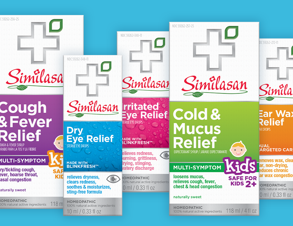
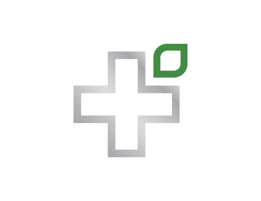
Similasan
I helped concept and design is packaging and branding refresh for the homeopathic health brand Similasan. Not wanting to abandon their existing logo they opted to add-on a larger graphic element to the mark. The goal was to create a stronger connection between natural ingredients and efficacious care. We landed on a large silver cross locked-up with a graphic leaf to symbolize this. To add a more premium touch this mark along with other graphic elements are presented in silver foil.